Hi there!
Hope you are having a good day today. I’ve been on a real blog kick lately! I have 2 posts that I’m planning to write and I FINALLY finished the redesign of my blog.
This has actually been a couple months in the making. It’s much different than my last one, but I thought I needed a change. This is by no means the final design. I will be playing around with sizes and layout still. It didn’t take me all that much coding to do or anything just because I used the drag-and-drop style of the blogger layouts. Some things that I might add are an instagram or a twitter feed to the sidebar. It’s looking quite cluttered right now though so I’ll have to see how it works out.
I made the header in photoshop, but I didn’t make the social buttons. Full credit goes to The Dutch Lady Designs.
So what do you think? Any critiques? (I myself have a lot haha) Do you change your blog layout often?
Thanks for reading, hope you have a great day!


18 Comments
I think it's nice and functional as I like having the archives and labels section on blogs when I visit them so I can look back if I remembered they have a post I want to reference. The header is cute!
OMG YOU DESIGNED THIS??! Kudos!!! I know NOTHING about coding, but I can tell it's monumental work! I like the font a lot. It's very nonchalant 🙂
Well done! I really like this. It's clean and organized.
Looks awesome! I miss using blogger, I find it's so much easier for designing a nice layout. I definitely need to play around on mine a bit (for some reason it's not phone friendly!)
I like your text, but it feels kind of squished. Squished? is that the right word? Keep with a sans serif font for sure though! Other than that you're on a roll! 😀
Hooray for a new look! I really like the header font–and I just think it looks better than the old layout 😀
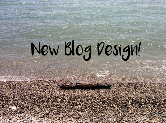
Also…IS THAT 'STOCK' PHOTO FROM THE PORT UNION BEACH OR
Thank you! 🙂 That's exactly why I like having them too. I feel like I actually use the search function on my own blog a lot! The only thing is that it looks super text heavy…I'll have to play around with the positioning I think!
Haha, I don't want to give you the wrong impression! Blogger makes it pretty easy to change background, fonts, etc. I had to hard code a bit of stuff like the header, but luckily there were lots of tutorials to help me through it! Thanks again Sunny!
Thanks Julie, that means a lot. 🙂
I love your design, it looks really nice 🙂 I love your header too!!!! 🙂 I am in the process of redsigning my blog page too, any suggestions you can give to me? Thank you Melanie 🙂
Thanks so much Whitney!
Aww thanks Janet that's so nice. I would say my biggest suggestion is to look at other blog layouts. How did they do their sidebar? How did they do their labels? Where are their social media buttons? I would say the biggest tip is to ensure that your content is always readable! My last layout was quite busy, so I think it took a lot away from my content!
Good luck and can't wait to see how it turns out!
Thanks so much for the critique Elyse! I totally totally agree with you. The sidebar is so text heavy right now that it's making it look busy. I'm gonna have to figure out a way to cut that down. Maybe I'll do text images of my labels to help break it up a bit?
AH it looks really nice! I would recommend removing the navigation bar at the top and maybe switching to the custom mobile template in blogger instead of the simple template.
Ahhh! Thanks for the tips! Very easy to follow too haha. Did you mean navigation the blogger one? Or my About Me, Disclosure, etc.
Oh and weird, I changed from 'Default' to 'Custom' and it kind of messed it up. Disqus disappeared and the fonts went a bit more funky. :S
The default blogger navigation. I don't understand why blogger keeps it even though it doesn't really do anything now!
Ah that's too bad :/
Ah that's what I thought! Thanks!